Completed: September 2021.
Funding: The Pew Charitable Trusts; ASFPM.
Committee Overlap: Flood Insurance.
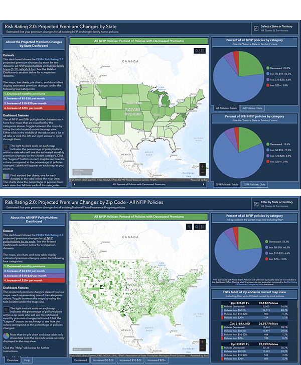
The ASFPM Flood Science Center has created three new easy-to-use data visualization dashboards that show the projected premium changes for policyholders by geography, using datasets from FEMA's analysis of NFIP policyholder information. The data are broken down across four categories — ranging from a decrease in monthly premiums to an increase of $20/month or more – and displayed in map, pie chart, and data table formats. A color-coded scale indicates the percentage of policyholders in each category.
The state-level dashboard shows projected premium changes for each state and territory:
For those who wish to take a deeper dive, there are two dashboards that display the projected premium changes at the zip code level, one for existing single-family home policies and the other for all existing NFIP policies:
- Projected Premium Changes by Zip Code: Single-Family Home Policies
- Projected Premium Changes by Zip Code: All NFIP Policies